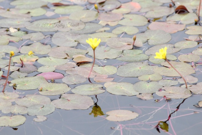
The principles of design are the ways in which the elements are arranged to make the design work well. These principles include structure, unity, balance, perspective, hierarchy, scale, and contrast. I will use some of my photos here to illustrate.
The first image here, of the little dog, can illustrate the idea of balance. There are two main sets of colours – the greens and the greys/whites. The greens are darker and have more visual weight than the grey wooden boards, but the addition of the dog in that part of the image help to balance the weight of the colours. The dog is off-centre to the left, but the image is still balanced – as the the weight of the dog is balanced against the space it is gazing into.

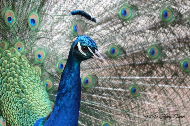
The peacock here illustrates the idea of emphasis. The vivid blues of the peacock’s neck and head are so concentrated as compared to the distributed blues in the feathers that the neck and head are emphasised – bringing our attention to this part of the image.
The photo of the moss-covered fence help to illustrate perspective. You can see that the objects that are further away are less in focus and also smaller.

The side of this old farm shed uses the principle of rhythm and repetition with wooden planks. There is enough variation in the planks and colour to create interest or this would be a very boring photo!

These little beetle photo gives us an example of the use of scale. The size of the beetle would be unknown if it was not seen running along my daughter’s little finger!